Case study
Crafting a path to financial success: VALOR's redesign
Rethinking the whole experience to make users dreams come true
Redesigning the portal for VALOR was an amazing experience, as it serves as the gateway for users to pursue and achieve their financial dreams. Their portal isn’t just a platform; it’s a tool that empowers individuals to make informed investment decisions that can shape their future and the future of other generation. By recreating the portal with a focus on clarity, accessibility, and user-centric design, we are ensuring that every visitor can easily navigate complex financial information, access accurate data, and utilize planning tools that guide them toward their goals. The stakes are high, as this portal plays a vital role in transforming aspirations into reality through strategic content and direct contact with experts in the investment area.
The responsibility of designing such a platform goes beyond technical execution. It’s about creating a trusted space where users feel confident in their financial journey. This means we must prioritize precision, reliability, and thoughtful planning at every step of the redesign process. By doing so, we not only enhance the user experience but also uphold the company’s commitment to helping people realize their dreams. A well-crafted portal serves as a solid base for trust, enabling users to access the information or the resources they need to plan effectively and achieve the financial security and success they aspire to.

Simplify and look out for regulations
Financial companies must meet strict regulatory compliance, including WCAG accessibility. Crafting a simple, intuitive design under these constraints was a major challenge.
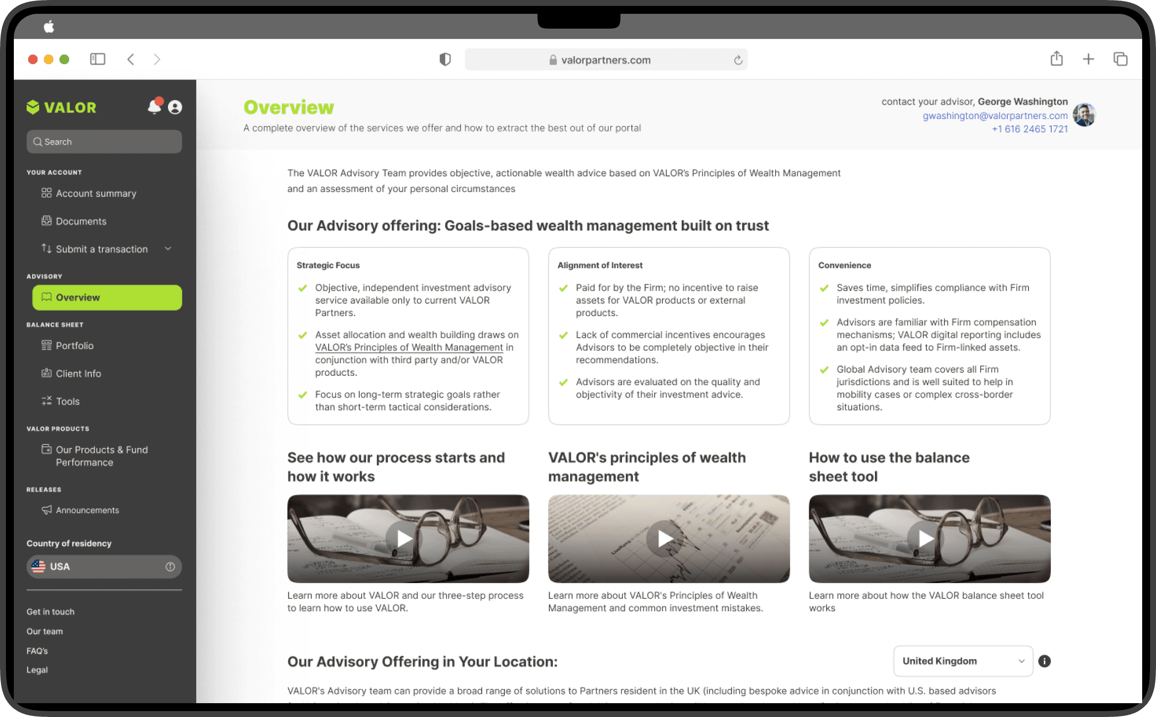
Understand the users needs and wants
Different users needs, wants and painpoints played a pivotal role in shaping our main page, allowing us to craft a variety of tailored options that cater to diverse needs. By analyzing how users interact with our platform—whether they’re seasoned investors, beginners, or somewhere in between—we identified key touch points and preferences that guided us in the process of crafting the main page. This understanding enabled us to present relevant choices and features upfront, ensuring that every user can easily find the tools and information they need, creating a more personalized and efficient experience.

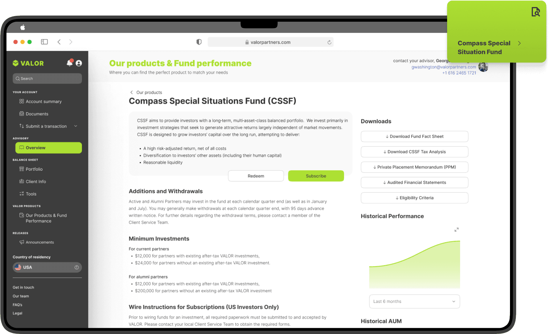
Information is the key
Having detailed and hierarchically organized information about each fund is crucial, because it allows them to make informed investment decisions with confidence. This structure provides a clear overview of essential data, such as performance history, risk levels, management details, and underlying assets, all organized in a logical and easy-to-navigate manner. Users can quickly understand the key aspects of each fund, compare options, and assess how they align with their investment goals and risk tolerance.
Users choices matter
Users have the ability to bookmark our special advisory content, information and suggestions, allowing them to create a personalized repository of information that aligns perfectly with their individual goals and preferences. This feature enables users to easily save and revisit content that resonates with their investment strategies, ensuring that the most relevant insights are always at their fingertips. By curating their own collection of tailored advice, users can navigate their financial journey with greater focus and confidence, drawing from a wealth of resources that are directly oriented to their unique needs.


💚 💛 🩵